Colour trends rise and fade, yet some shades remain timeless. One of these enduring hues is colour loden, a rich earthy green steeped in tradition, culture, and design significance. From its humble beginnings in Alpine villages to its place in modern fashion runways and interior spaces, loden has consistently represented elegance, practicality, and connection to nature. This guide explores the meaning, history, psychology, and uses of this unique colour, providing inspiration for fashion enthusiasts, designers, and homeowners.
What is Colour Loden?
At its core, colour loden is a muted, deep green with earthy undertones. Unlike the brightness of emerald or the softness of sage, loden carries weight and depth, often blending gray and brown tones within its green base. It is more subdued than olive yet warmer than forest green, making it versatile and easy to integrate into various contexts.
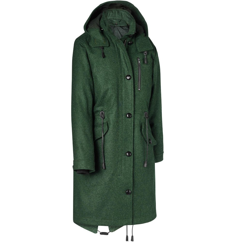
The term “loden” originally referred not to the shade but to a thick, water-resistant wool fabric produced in Austria and Bavaria. Over time, the fabric’s iconic green became so closely associated with the word that “loden” evolved to describe the colour itself. Today, whether in textiles or design palettes, loden denotes both tradition and understated elegance.
The History Behind Colour Loden
The roots of loden stretch back centuries to the Alpine regions of Austria and Germany. Peasants and hunters in these mountainous areas needed durable clothing to withstand harsh winters, so they crafted coats from dense, oily wool known as “Loden cloth.”
Over time, the Austrian nobility adopted loden clothing, particularly the famous Lodenmantel (loden coat), which became a staple in aristocratic wardrobes. By the 19th century, loden coats had even reached royal circles, with Emperor Franz Joseph of Austria reportedly favoring the style.
Loden’s journey didn’t stop in traditional wear. It gained popularity in military uniforms for its practicality and camouflage qualities. Later, fashion designers integrated the shade into seasonal collections, transforming loden from a rural necessity to a global style icon.
Understanding the Shade – Characteristics of Colour Loden
Colour Values
Designers and digital creators often require exact values. Here’s a useful breakdown of loden compared to similar hues:
| Shade | HEX Code | RGB Values | Characteristics |
| Loden Green | #4A5D23 | (74, 93, 35) | Deep, earthy green with gray undertones |
| Olive Green | #808000 | (128, 128, 0) | Strong yellow-green, more vivid |
| Forest Green | #228B22 | (34, 139, 34) | Dark, natural green with cooler tones |
| Sage Green | #9CAF88 | (156, 175, 136) | Soft, muted green with pale undertones |
Key Traits of Loden:
- Muted depth that avoids overpowering spaces or outfits.
- Earthy roots that connect it to nature, forests, and tradition.
- Versatility, suitable for both conservative and bold applications.
Colour Loden in Fashion
Fashion houses frequently return to loden for its timeless appeal. It works especially well in autumn and winter collections, where muted tones dominate. The colour’s versatility means it pairs seamlessly with neutrals like beige, cream, and charcoal, yet it also complements bolder shades like burgundy or mustard.
Why Designers Love It:
- It projects sophistication without flamboyance.
- It’s seasonally adaptable, especially in colder months.
- It conveys tradition yet feels modern when styled correctly.
Case Study – High Fashion Use
Hugo Boss and Burberry have incorporated loden tones into coats, trousers, and accessories in recent collections. The appeal lies in loden’s ability to appear luxurious without being flashy—a perfect fit for understated elegance.
Outfit Ideas:
- Men: Pair a loden wool coat with dark denim and leather boots for a refined urban look.
- Women: Combine a loden knit sweater with beige trousers and gold jewelry for cozy sophistication.
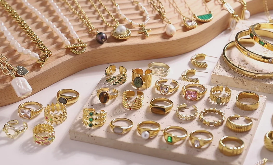
- Accessories: Loden handbags, scarves, and hats add subtle depth to an outfit without stealing the spotlight.
Colour Loden in Interior Design
In home décor, loden brings warmth and calmness. Its connection to nature makes it especially effective in spaces where comfort and relaxation are essential.
Best Uses in the Home:
- Living Rooms: Loden sofas or accent chairs ground a space with depth.
- Bedrooms: Bedding or walls in loden create a cocooning, restful atmosphere.
- Studies: The shade fosters concentration, making it excellent for workspaces.
Perfect Material Pairings:
- Wood: Oak, walnut, and reclaimed timber enhance loden’s natural appeal.
- Stone: Marble or slate offers contrast while preserving earthy harmony.
- Metallics: Brass or antique gold accents enrich loden’s subdued luxury.
Interior designers often use loden accent walls combined with lighter neutrals for a sophisticated yet welcoming palette.
Symbolism and Emotional Impact of Colour Loden
Colours influence how we feel, and loden carries powerful psychological weight.
- Nature Connection: Evokes forests, moss, and Alpine landscapes.
- Tradition: Reminds us of heritage clothing and rural craftsmanship.
- Stability: Suggests reliability and understated confidence.
- Sophistication: Offers quiet elegance rather than bold statement-making.
As design psychologist Karen Haller notes, “Earthy greens ground us. They remind us of security and connection to life itself.” Loden embodies this philosophy, making it a colour of trust and refinement.
Practical Uses of Colour Loden Today
Beyond fashion and interiors, loden has found its place in diverse industries.
- Furniture: Sofas, chairs, and rugs often use loden to balance bold spaces.
- Textiles: Blankets, curtains, and upholstery showcase the colour’s warmth.
- Graphic Design: Brands use loden to signal sustainability, tradition, or eco-friendliness.
- Outdoor Gear: Jackets, backpacks, and boots benefit from loden’s camouflage qualities.
In recent years, sustainability-driven brands have embraced loden, aligning the shade’s natural connotations with eco-friendly messaging.
How to Pair Colour Loden with Other Colours
One of loden’s strengths lies in its pairing flexibility.
Complementary Matches:
- Cream and Beige: Add softness and balance.
- Mustard Yellow: Creates an autumnal, vintage feel.
- Burgundy: Rich contrast with a sophisticated edge.
- Charcoal Gray: Sleek, urban balance to loden’s earthiness.
Example Palette:
| Palette Name | Colours Included | Mood Created |
| Rustic Warmth | Loden, beige, mustard, walnut brown | Cozy, welcoming |
| Urban Modern | Loden, charcoal gray, black, brass | Elegant, contemporary |
| Nature Retreat | Loden, sage green, cream, stone gray | Calming, rejuvenating |
Using loden as the anchor, these palettes adapt seamlessly to both fashion styling and home décor.
FAQs About Colour Loden
Is colour loden the same as olive green?
Not exactly. While they share similarities, loden is more muted and earthy compared to olive’s yellow-green vibrancy.
What season is best for wearing colour loden?
It shines brightest in autumn and winter, though lighter fabrics make it wearable year-round.
Can colour loden be used in minimalist décor?
Yes. When paired with soft neutrals like cream or pale gray, loden becomes a grounding element in minimalist interiors.
Final Thoughts – Why Colour Loden Stands Out
Few colours embody such a blend of history, versatility, and emotional depth as loden. Its roots in Alpine tradition give it heritage, while its adaptability keeps it relevant in modern fashion and design. Whether you’re styling a wardrobe, curating an interior, or designing a brand, colour loden offers timeless appeal.
In a world that often leans toward fleeting trends, loden stands as a reminder that true style comes from balance—between tradition and innovation, subtlety and sophistication, practicality and beauty.


Leave a Reply